Today I was at a book shop, there was a sale and I wanted to get some of those old sci-fi books from my youth.
I went to look at the fantasy section, and please know this is like THE feinschmecker book store in Copenhagen, it doesn’t get more posh than this. Why was I there you ask? well because my oldest spawn works there, and because i get a discount on the books and the coffee… what’s not to love?!
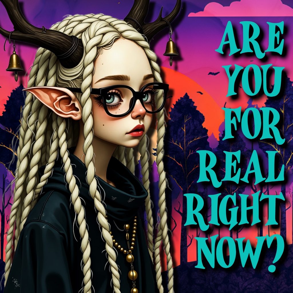
But looking at those fantasy books (including sorta YA horror & sci-fi), they had a wall with the most important, bestselling new titles. And I swear, like more than half had AI covers.
SO SHUT THE FUCK UP!
I mean when I told my daughter (she was there too), she said, yeah – well people might not have noticed?
And this made me think of two things, you know?
1. being that this is exactly why so many does not disclose they are using AI for cover work, because of those people who does the ai cover = ai book, deduction. And as I said before, you can’t win, because if you disclose it, you are a scam artist, and ppl warn others to not get your book, and it will damage not only your rep, but your numbers too. If you don’t tell, you can risk people find out anyway, and believe me they will look for it! And then you’re hung out as a scam artist.
Damned if you do, damned if you don’t.
And of course the whole reason for that, is that those fuckers just want you to not use AI cover art, period.
2. the people bitching are keyboard warriors, and have an opinion on fucking reddit and tiktok or some shit. But in real life they don’t really care, so they don’t exactly put their money where their mouths are. And it would kinda look like that is the case, since the big selling authors of YA fantasy is selling just fine, AI covers or not.
So as long as no one is looking, you can get those books. Kinda remind me of all those old men who would rage against prostitution, and yet use their services when they thought no one was looking.
double standards. Yep, we got them.
3. This is an American thing, and outside the US no one really gives a flying shit, because here we got unions, and job development.
–
And it does actually seem to me that this anti-ai is very much an American thing, at least the most vile, verbal ones are Americans. And you gotta wonder why that is.
I mean I saw posts on my fb against AI, but that was to bring attention to a scam, an actual scam – where they are selling shit like those crystal mugs. And we can all agree that is a shitty thing to do. But nothing as disgusting as what you find on for instance Reddit.
And just the other day, someone did make a comment on Reddit in regards to this, saying they simply didn’t understand this, because no one gave a shit outside of Reddit. And that is basically true, no one cares if it’s AI or not, at least not where I live. If it looks too much like a recruitment poster from Jehovah Witness’ you’d roll your eyes and laugh. But that’s it.
–
And it sorta makes me feel a little better, and it gives me some hope that we might eventually get to a point where it’s not important anymore, and no one gives a shit if your cover is AI or not. There are good and bad AI book covers.
I must admit as a part of my new year resolution, I ignore the negativity surrounding this topic, and I am just going to pretend it doesn’t exist. because those people can fuck right off. Admittedly you’ll have to search to find the positive articles about it, because it’s much easier to be angry mud slinging, without understand anything about it.
But you could try and read this article, I found it informative.
And this is a service that I use, I mean Night Cafe, I never tried to make a cover – I might have to try right now, just for this post. https://creator.nightcafe.studio/trend/ai-book-cover-generator
So I had to try.
I made a fairly simple, non descriptive (besides the color scheme) prompt, figuring that would work for this experiment, and selected the ‘basic Anime’ option, to whatever end. Figuring it would be the one of these, that would give me the best bright comic style.
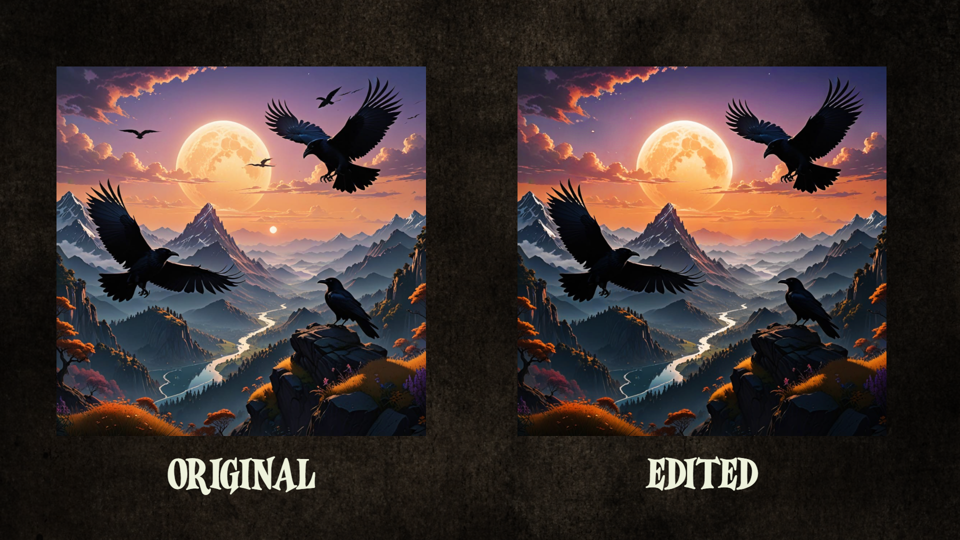
This is what it made for me, and if you notice the weird birds in the background, and the extra sun in the sunset.. well I edited that out, and made the colors a little richer, that is basically the extend of my edit. But I thought it would be enough to get my point across.
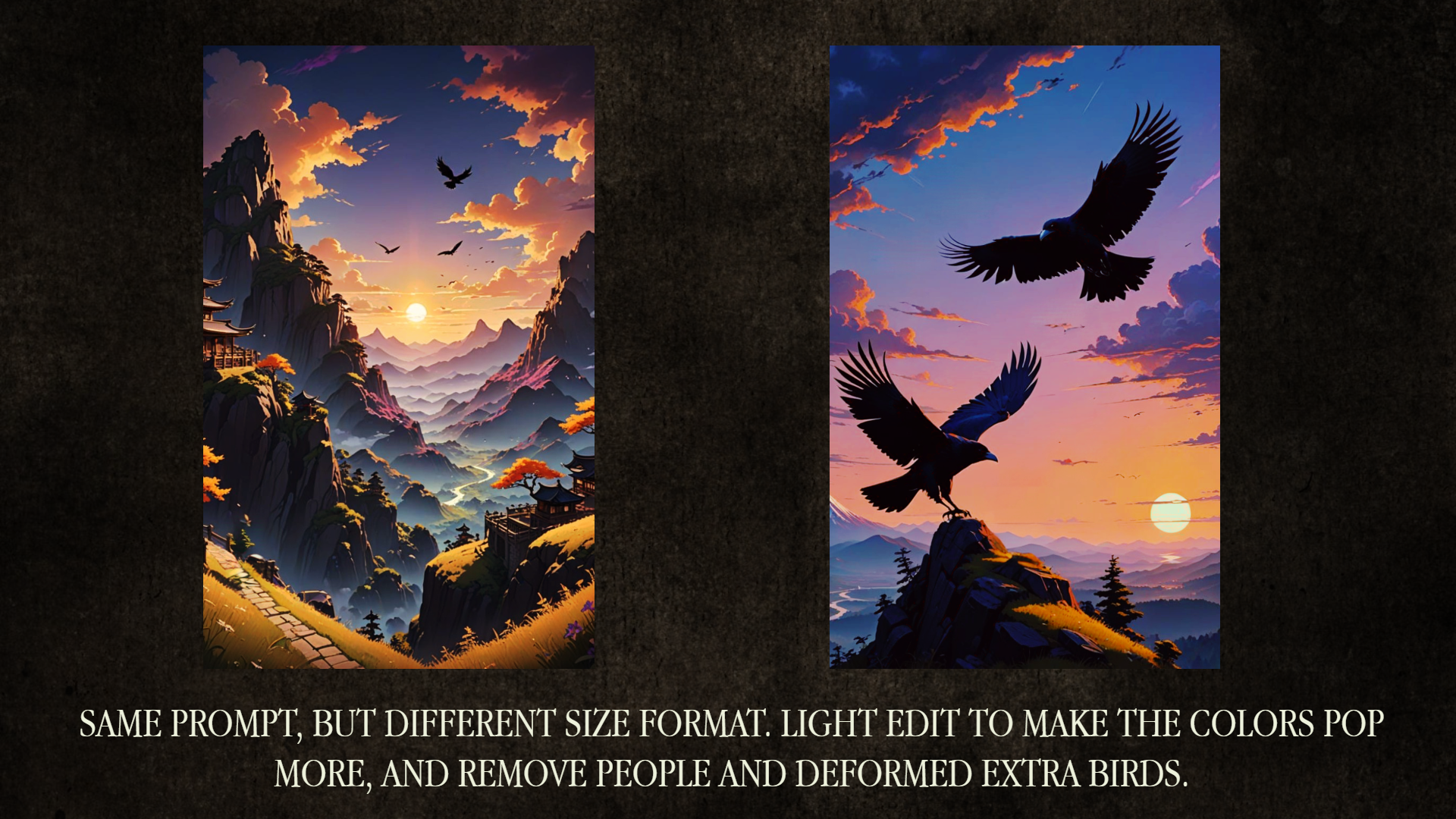
So I changed the format to ‘portrait’ to make it tall like a frontpage of a book, and the size I used for these edits, is the standard size for Wattpad book covers. They are mad slim for some reason. Anyways, as I say on the card, same prompt different dimension, and also i edited them more than before, to make it pop even more. One in more orangey deeper and darker hues, and the other more pastel. This is an “easy” – (photo editing isn’t easy at all if you’re not used to it, so it’s kinda a lie) way to convey the feel of your book, colors say a lot about the general vibe.
Now I didn’t bring the heavy guns, and all of these are just edited with brushes and filters already in the program I use to edit, I didn’t use my own vectors and correction layers.
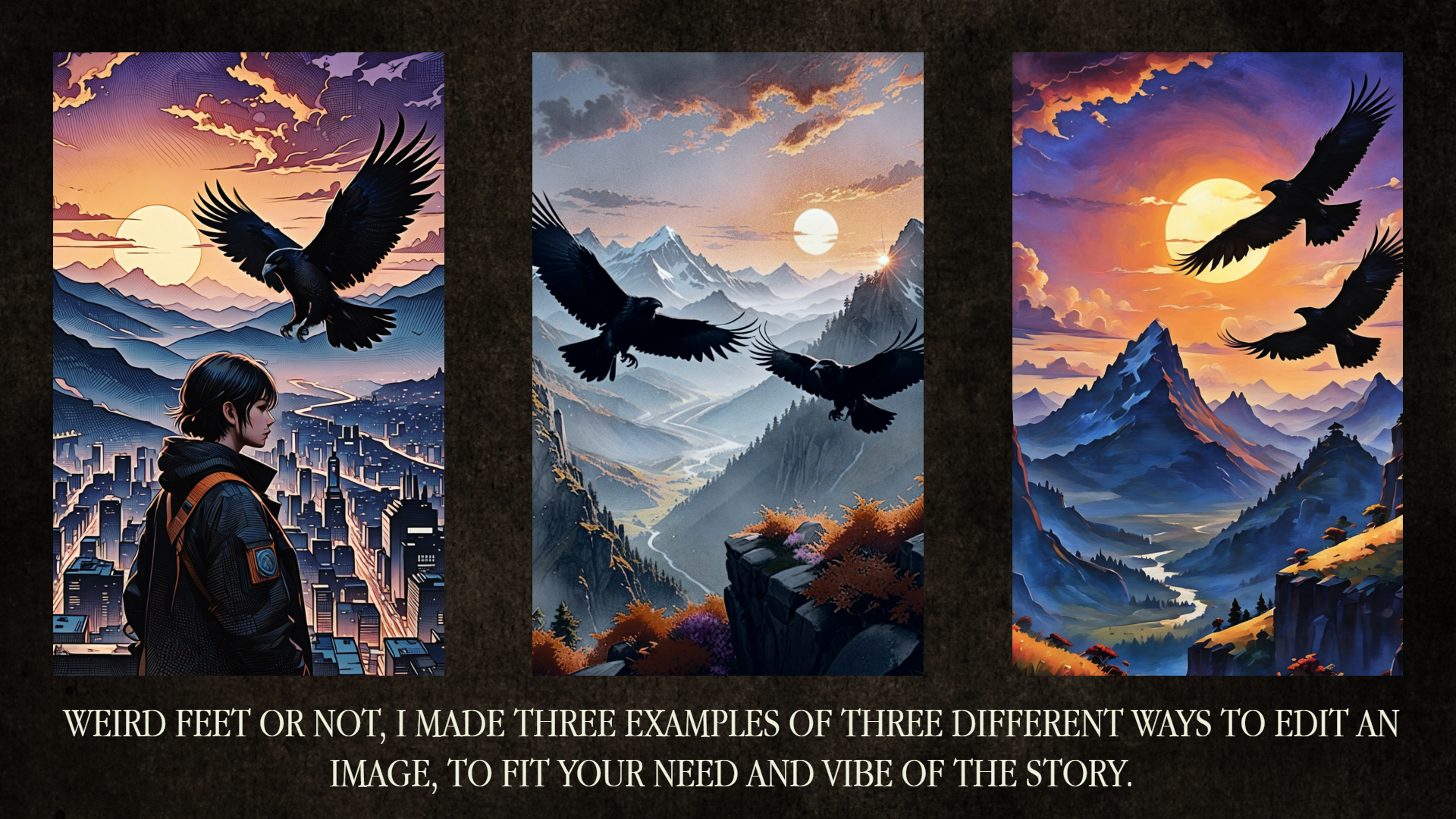
Still the same prompt, and well honestly I just asked it to make 2×4 of the same image. So there’s that. This also shows how different outcomes you might get, and also I didn’t use any custom models, or tweaked anything in Night Cafe. This is the exact same base Lora which it used from that starting page as a default, only difference between these images and the first, is the fact that I changed it from a square to a taller square.
So these images I tried to use 3 different ways of editing, they are more edited than any of the others, since brushes, color correction and so forth (still only the custom ones in the editor program), was used on different areas of the image to get a specific style, like hand drawn (the first), grainy & muted (the second) and painted (the third).
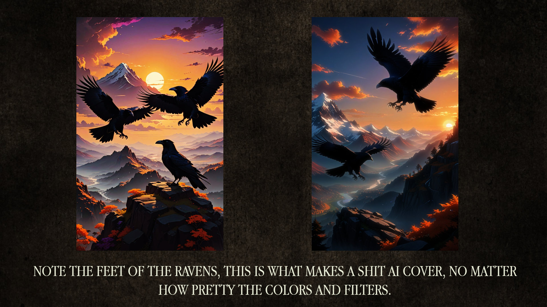
I didn’t correct these, besides the color, one is made with very bright clear colors, the other is made to look more blurred and dreamy. But at first glance these look fine if you aren’t that experienced in making covers like this. But look at the feet of the ravens, and the floating mountain on the left one – they look awful, and really gives it away instantly that it’s AI art.
Because it’s a very difficult edit, the quick solution could be something like below.
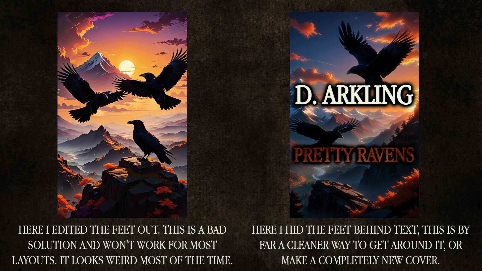
And as you can see, we now have two sausage ravens without feet, and this could perhaps work on some layouts (it deffo doesn’t work for this, and I’d never in my damn life use it like this, but it is sometimes an option, if it’s something easier to edit away, like horns, or two suns or stuff like that. Fingers are notoriously hard to edit too, and I would not use a layout with 6 fingers on one hand, and I wouldn’t attempt to edit it either. Hide the hand or make something else. You can always edit your way out, making something similar and stitch the images like layers.
The image to the right, there I hid the weird root like feet with text, that is as I mention, by far to prefer, if it’s a layout like this, which works well for text like that.
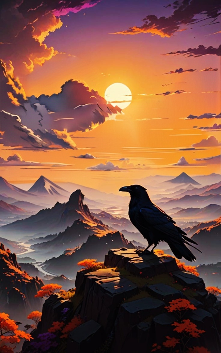
And just for the fuck of it, I played around with that last image to the left. And editing out the ravens, and editing the mountain into a cloud works fine. I didn’t want to spend too much time for this silly show and tell kinda thing, this entry turned into.. but I do see the weird mountain top, it just looked better letting it stay. And well I could always hide it with text if needed be.

Leave a comment